Seattle Metro and Property tax
Hello Readers,
Thanks for stopping by!
For this project I chose to analyze how bus frequency relates to property tax! We could entertain many different theories as to how these two relate to each other, and to get started I just wanted to do some basic visualizing.
A few months ago, I did a study on property tax per square foot in Seattle. I will be using that same data for the individual parcels and their associated property tax for this project.Additionally, I will be using GTFS data from King County Metro to track the stop locations and frequencies for all stops in Seattle.
Let’s first take a look at the parcel and tax data for the City of Seattle.
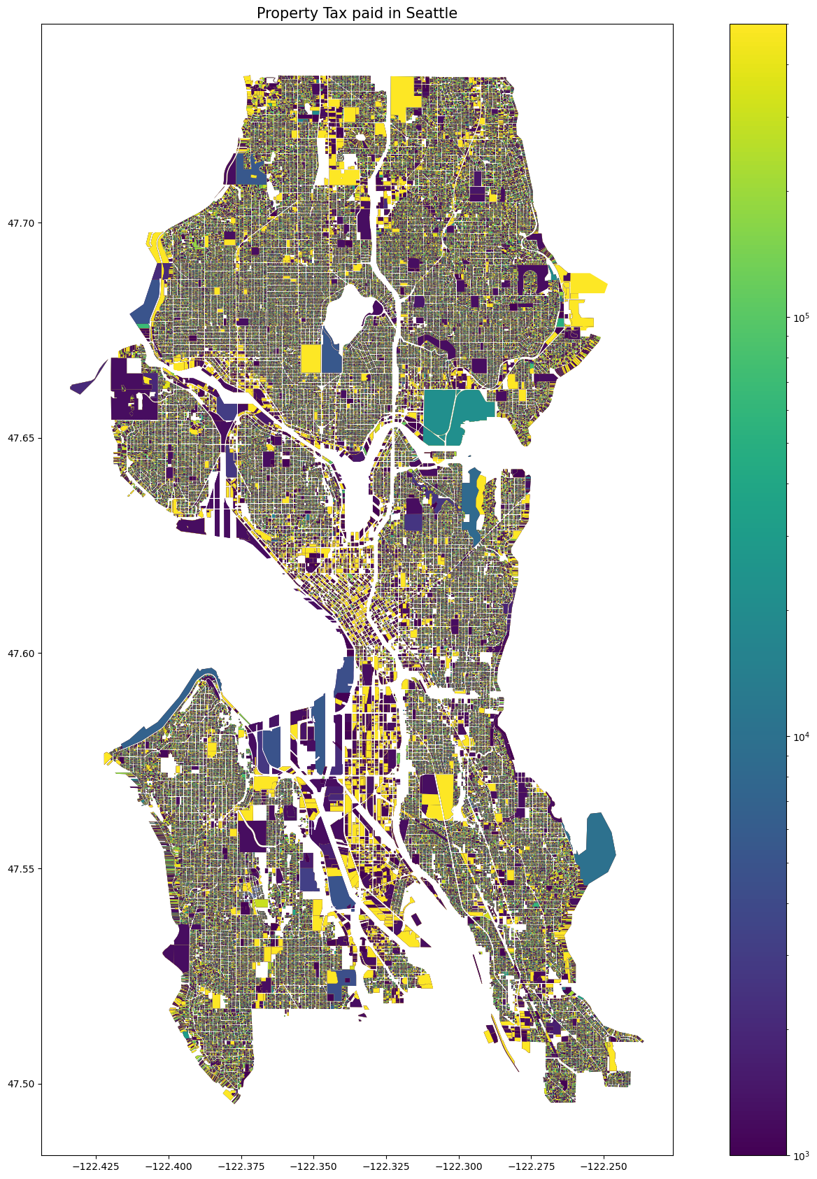
As you can see here, this map displays every property parcel in the city, colored by how much property tax that property pays. You can also probably see that the map is a bit difficult to look at. The colors are so smushed together that it is hard to tell what is going on. I will try to remedy that.
Let’s now look at the bus data! To try to best approximate which parts of Seattle are best served by our public transit, I used stop location and route data to calculate exactly how many times each stop was stopped at in a multi - month period.
See the location of every stop here.
Let’s take these two very different images of Seattle and try to chop up the data to find some similarities and differences between our property taxes and our transit system.
To help aggregate this data in an effort to make it more digestible, I opted for hexagons! As usual, I used the H3 Python library, developed by Uber to divide everything into hexagons. H3 creates a new GeoDataFrame with the hexagon as the index and the other numerical columns of the occupants of that hexagon summed together. It is really quite convenient.
Here are the property taxes broken down into hexes.
Note how you can really see the neighborhood centers bringing in the most tax income. Outside of downtown, we see Ballard, Fremont, and the U District as the most profitable areas.
Now let’s look at the bus frequencies with that same hexagon breakdown. Note that the hexagons are a bit bigger this time around; this is to accomadate for the fact that bus stops are a more spread out through the city than the property parcels.
We can see in this map that the concentration in the downtown district is even more pronounced than the property taxes, and the neighborhood hotspots are even more pronounced.
After making these maps, I started to think that the hexagons were not the ideal way of representing the different parts of the city. So I took those same data, transferred the parcels to points, and arranged them by neighborhood!
Here are both of those maps.
First, the property tax.
And now the bus frequency map.
These maps are both adjusted to account for the land area of the neighborhoods, so it is really property tax paid per square foot and amount of bus arrivals paid by square foot. This helps illustrate how our tax incomes and transit services differ neighborhood by neighborhood. Hover over any neighborhood on the map to see the number of stops/property tax income and the neighborhood name.
This concludes my serious maps for the post, but I thought I’d share one more.
Just for fun, here is a map of Amazon’s internal bus service - from March of 2018. It is interesting to see where a private company chooses to locate its stops!
Thanks for reading! You can find all the code I used to make these maps here, and here you can find the data I used for the transit, the taxes and the parcels.