Bus Routes and Sankey Diagrams
A different way to display bus route ridership
Hello dear readers!
As one of the world’s leading Aaron Schechter historians, I can comfortably say that this is one of the coolest things that I/he has ever made! This blog post is a bit of a departure from my usual style on this website, where I usually try to analyze, visualize, extract meaning from and display data sets. In this project I used 100% fabricated data to focus entirely on a new method of visualization.
I’ve been planning this blog post for over a year now. Last fall (2024) I made a Sankey diagram for a project with SDOT to describe the ridership, including the boardings/alightings, of Seattle’s troubled and important Route 8 at each different stop along it’s route. See that Sankey Diagram below.
Route 8 Ridership Sankey Diagram
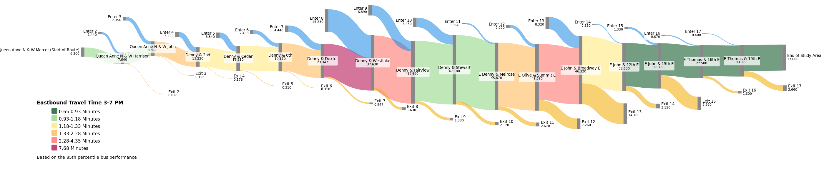
The above image displays the average departing load of the bus as the ‘trunk’ or center line of the diagram, the passengers boarding are shown in blue on the top portion of the image and the passengers getting off are in orange at the bottom. In addition to that the color of the trunk denotes the speed of the bus.
I was overall pleased with this diagram and it’s communication of information, but I couldn’t shake the feeling that it deserved to be on a map!
The major weakness of the Sankey Diagram, in my opinion, is that it can be difficult to picture where exactly these stops are. For this reason, I have been mulling over how to pull this off for about the last year or so.
Making an Interactive Sankey Diagram overlaid on a map
Prior to this project I have really enjoyed using the Python packages Geopandas and/or Folium to make interactive maps displaying data. So I decided to go that route for this project and I am happy to show you the results :).
In my first attempt at plotting an interactive Spatial Sankey Diagram I made line segments in a traditional manner and varied their thickness and color based on the average departing load. Additionally I had boarding and alighting line segments branching out from the primary line as well. See the result of a small section of the E Line plotted below.
I believe this generally works at communicating the information, especially with proper context, but leaves plenty to be desired visually. The lines don’t flow together at all, the thicknesses change suddenly, it can be a bit difficult to decipher where the stops are, and most of all, it just doesn’t look like a Sankey diagram at all.
This is when I decided that rather than using line segments I would be better off using polygons. Thus begun a lot of tweaking and tinkering to make a curvy polygon, connect them together, project them onto a map, connect them together on maps, derive their positioning from data, and to make it all look good in the process! This is all very much still a work in progress but I am happy with what I am working with so far.
Here is that same section of route that I plotted in the last map. Please drag the map around or zoom in/out to get a different view or hover over any route section to get the rider numbers that that specific portion represents.
This map shows a small portion of E line headed northbound (my signaling of the route direction could improve). The blue line down the center of the map represents the amount of people currently on the bus. Thinner is less people, thicker is more. The green line represents the amount of people getting on the bus at the stop that the line ‘flows’ into, and the red line represents the amount of people getting off the bus at the stop that it ‘flows’ out of.
More Maps + Challenges
The route portion above is particular conducive to producing a legible SankeyMap(Tm?). This is for two reasons. Firstly it shows a relatively short section of bus route, allowing the visualization to not get bogged down by too many stops. Secondly and most importantly the route is nearly entirely straight. Turns have been a serious nemesis of mine during this project, but I will avoid my fears no longer!
Please check out these visualizations of Route 44, going from Ballard to the University district and the 7, one of Seattle’s most ridden lines which goes from Rainier Beach all the way downtown, mostly on Rainier Ave. This visualization cuts off the southern portion of the route.
Final Thoughts
So far on this project I have focused more on reproducibility than perfecting the visuals. Because of this I can easily visualize more routes! All I need are the locations of the stops, and ridership numbers - real or fake - and I can make another rendition. Things like the line width, color and degree of curvature are tweakable. If you are reading this and have some suggestions as to how I could improve this work or would like to visualize some sort of transit route, please don’t hesitate to reach out to aaron.m.schechter@gmail.com! I would be very happy to hear from you and/or help out.
If you are interested, view the code I used to make these maps here.
Thanks for reading!!!