Biking + Walking + Driving, A Street Study
Attemping to compare different travel modes in different census block groups
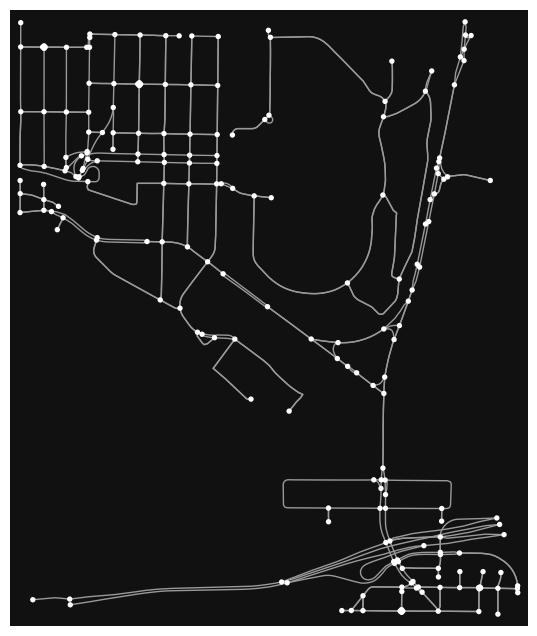
This has been a project that has evolved as I have been working on it.
I have been wanting to use the powerful OSMNX python package to analyze some of our city streets and mobility in a closer way.
OSMNX allows users to interact with data from OpenStreetMaps very closely and offers significant amount of data that can be sliced and spliced any which way.
Initially when working with OSMNX I was very impressed by the ability to visualize street scapes and break down the roads/streets into different travel mode types. Here are two images of Seattle’s Madrona Neighborhood.
Madrona Driving Network
Madrona Walking Network
Madrona is a primarily single family neighborhood with relatively standard residential streets.
Now see two similar maps, this time in the 1000 feet surrounding Bloedel Hall on the University of Washington Campus.
UW Seattle Driving Network
UW Seattle Walking Network
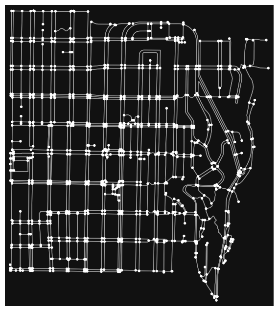
Splitting things up into Census Block Groups
Block Groups are great because they are small. At larger scales, such as entire neighborhoods or even cities, you can really lose the regionality of data. We all know that different parts of town are different, and splitting my analysis up by block group felt like a good way to make things smaller.
I used the Python package ‘censusdis’ to download and wrangle some census data. Enjoy this map showing the Median Household income by Block Group.
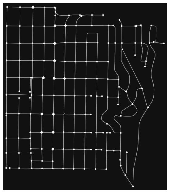
Ok moving on to the block groups, here is a map of the street layouts in a single block group.
Hover over the individual segments to see the type of street they are classified as.
Analyzing the Amount of different Segment Types in a Block Group
I decided that I wanted to try and count the number of all the biking, walking and driving segments in each census block group and compare them to each other. Easier said than done as it turns out. Or maybe my strategy was grossly inefficient. Plausibly both.
Open street maps doesn’t just divide segment types into ‘biking, walking and driving’.
They do an amazing job being specific, giving users of OSM data the chance to deeply analyze things. Here is an incomplete list of the Segment/Path/Way types that I came across
- primary
- secondary
- tertiary
- service
- residential
- footway
- motorway
- cycleway
- path
- steps
Non Driving Ratio
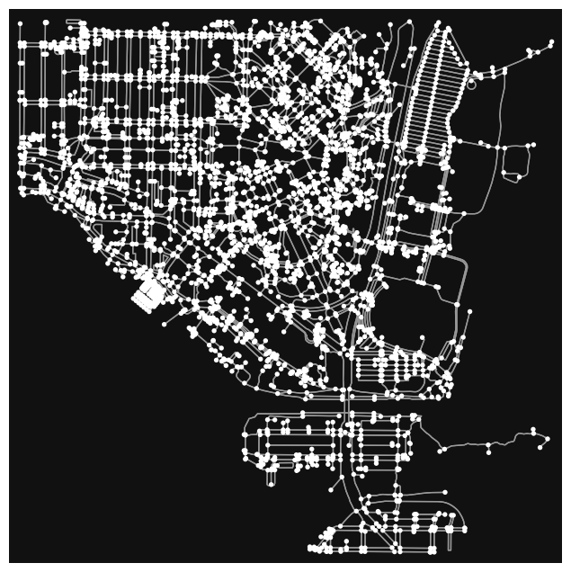
To Culminate this project I set out with the goal to calculate a ‘Non Driving Ratio’ for every block group in the city of Seattle.
This would be simple. The amount of segments dedicated to not driving divided by the amount of segments dedicated to driving.
After calculating that I would the go back through every block group and map it! This would display which parts of are city are most and least walkable but calculated in a very different way than normal.
I ended up managing to get this all to work but with far less than perfect code and some imperfections in the results
So now due to…. reasons… please enjoy the City of Seattle colored by ‘Non Driving Ratio’ split up into three sections.
Red Sections have an NDR of 0-0.4, Orange is 0.4-0.8, Yellow is 0.8-1.2, Green/Yellow is 1.2-1.8, Light Green is 1.8-2.5 and Dark Green is 2.5+.
In order to get the images to display properly I had to divide Seattle into four sections, shown from South to North. Apologies for the slowness you may see as you interact with the maps below, it is due to the large file size of the images displayed. I am currently working on how to represent the same data but decrease the file size.