Portland TriMet stop frequency
Hello Readers,
In today’s post I am diving in to General Transit Feed Specification (GTFS) data for the first time! I’m excited to start working with GTFS data becasue it is critically important to much of today’s transit data infrastrucutre. Giants such as Google Maps use GTFS as its data standard for bus and transit routes across most of the worlds major cities. The open nature of GTFS, which was developed by TriMet of Portland, Oregon in conjunction with Google, is why they also provide data structure and specification for some older and beloved transit info applications such as the Seattle area’s OneBusAway.
To pay respect to TriMet I chose to use their data for my mapping today. I’m keeping it simple by using only data pertaining to the bus stops for this project, but the GTFS provides data on both scheduled and real-time trips. All three categories are critical in delivering complete information and I’ll be using all of them for analysis in the future!
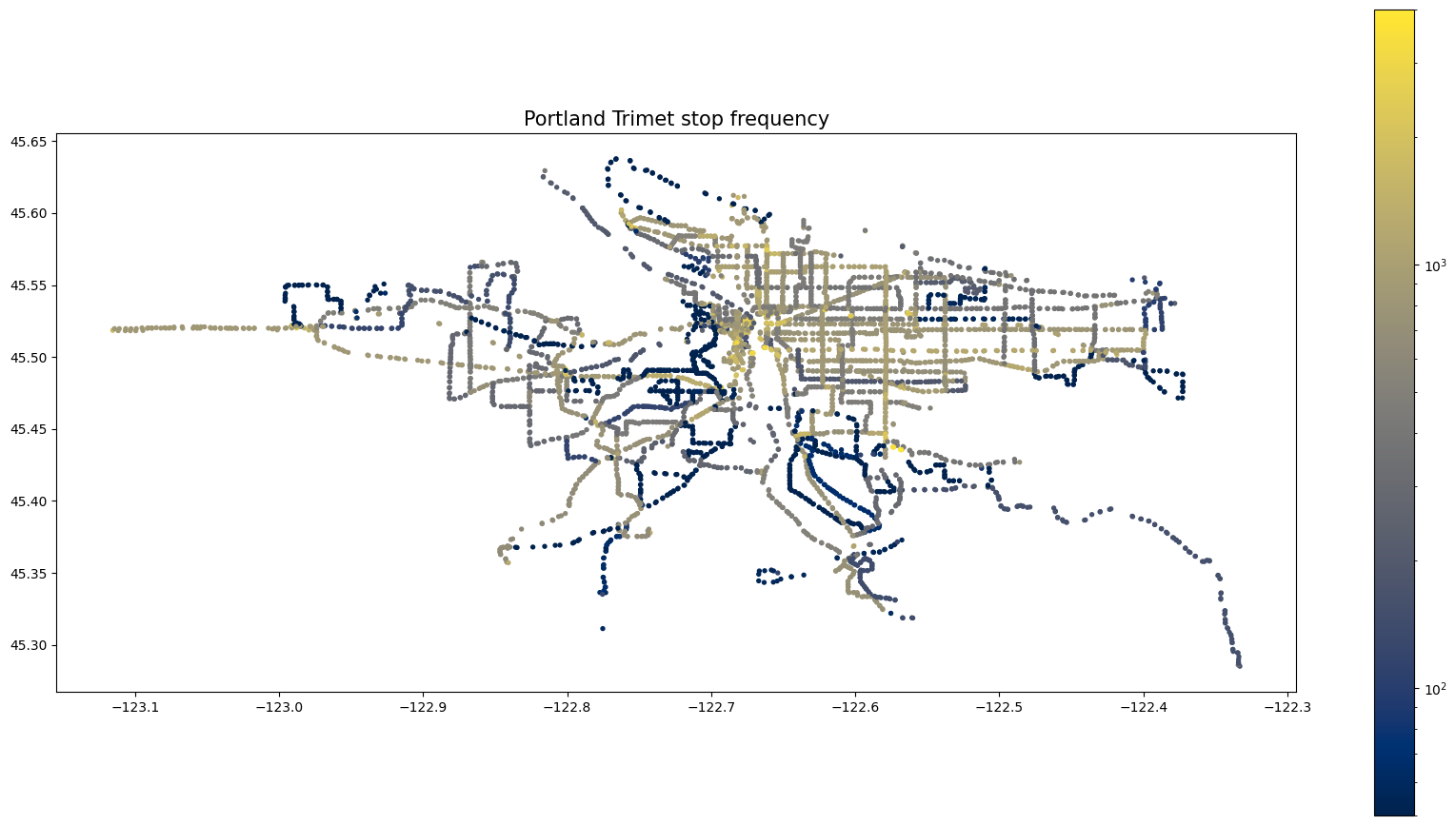
The map below displays every bus stop operated by TriMet, mapped using their latitude and longitude. The color scale signifies how many times per day buses are scheduled to arrive at that particular stop. Dark Blue means close to zero, yellow is a few thousand and grey is in the middle! Note the Log scale used to help visualize the scale.
Below is a display of nearly the same map, but interactive. Hover to see the stop name and amount of scheduled bus trips per day at that stop.
As with any large data set, displaying a large amount of data in one chart or image is a big challenge. That is why we aggregate! For this aggregation I chose to use PyDeck, a Python visualization library to help turn my data into interactive hexagons. In this chart the height and color are on the same scale, amount of stops today. This map helps to show the different transit hubs across the Portland area and the significant concentration in the center of Portland. To change the viewing angle of the graph, click and drag with your mouse while holding Ctrl or Command.
I hope these visualizations helped to communicate some of what is going on with the TriMet service.
Thanks for reading! Check out the code I used to make this post here, the official site of GTFS and the data source.