Pandion Pricing
Hello, Thanks for taking the time to check out my work!
This post is a little different than most of the rest I have done as I made it with a specific data set in mind, and worked backward to extract meaning from it. And that data set was the Pandion (Shipping Company) pricing guide, which you can find here.
This guide is pretty straightforward. It contains eight columns, but really it is seven plus an index. The left most column has the weight, going sequentially from one pound all the way up to 150. The other seven are all ‘Zones’. I was unable to find any concrete information about these zones, but I made a guess that they represented the distance from the original shipping point. Each data point in the zone column is a dollar amount, representing how much it costs to ship a package of the specified weight to that zone.
When I saw this pricing chart, I was delighted to see that there was a csv version that went with it! I took this chance to make a cool visualization about the pricing structure of Pandion shipping as it relates to both time and distance.
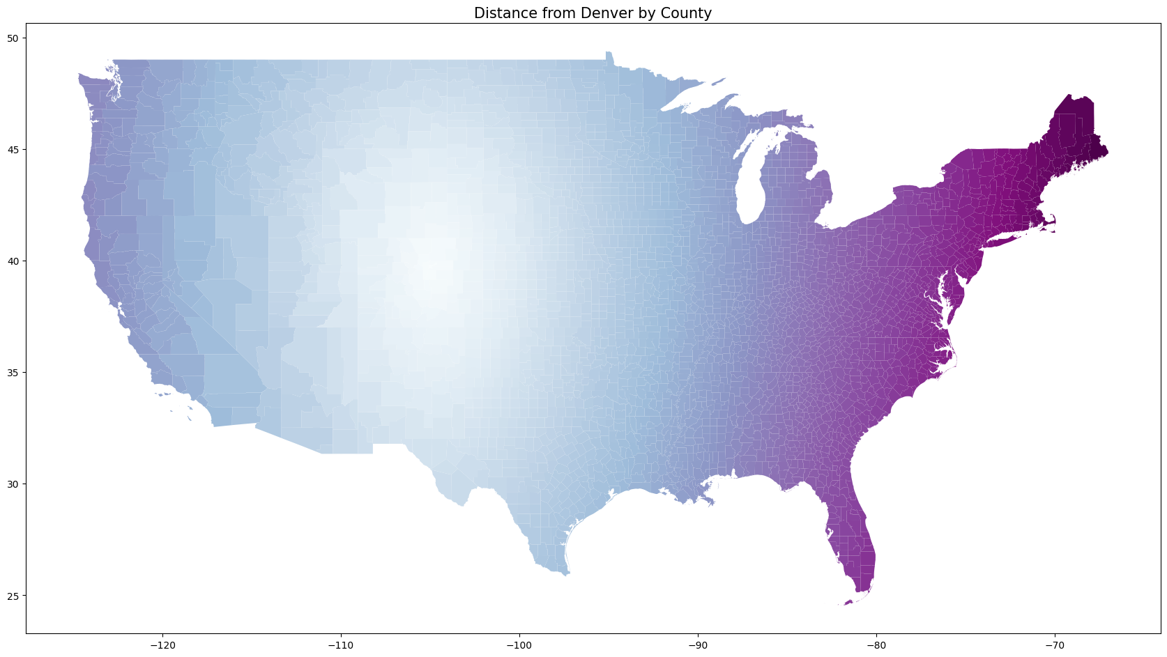
To get to work with this idea, I downloaded geographic shape data for every county in America. Using this data, I chose a relatively central location in the states, Denver, to focus my project on. Note that it would be a trivial change to do all of this same work on any other county in the lower 48.
Before involving any of the Pandion Data, I just made a simple chart representing the distance from Denver. Check it out below.
After doing that, I wanted to split the data into seven different ‘bins’, representing the seven shipping zones that Pandion uses. Because I don’t have any actual information on the zones, I guessed that each one represents a 500 Kilometer gap. Meaning Zone 1 is anything between zero and 500 kilometers from the starting location, Zone 2 is from 500 to 1000 and so on.
I split it up into bins and was able to project that onto an interactive map. The scale on the bottom right represents the price that you have to pay by zone for a one hundred pound package.
Now the final step in this is to try to represent both the price data and the weight data at the same time. The above map, even though it is interactive, you can only really see the prices at one weight.
My (attempted) solution to this was to incorporate a time slider. There are a number of flaws with the result, such as the lack of information on hover, and the mislabel of the time slider, which says ‘Wed Dec 31 1969’ when it should say the weight of the package, and a couple other imperfections as well.
With all that said I believe that it communicates some information quite well, namely (in my view) that the weight affects the price quite a bit more than the distance shipped does. Note that the scale remains the same for all locations of the slider, which is why the bins can appear monochromatic at times. If you look close the bins are still there I promise.
As you can see there is still work to be done with the timeslider visualization, but I am overall happy with how it turned out. Thanks to Pandion for providing the data, and of course Folium/Geopandas for the mighty visualization tools.
If interested, check out the code I used to do all this work here.
Thanks for reading!