Seattle Building Permit Applications
Hello Everybody! I have been on a journey to increase my familiarity with multiple visualization methods, and in that journey I have encountered some awesome ones.
In my opinion, a huge part of being a good data analyst and visualizer is picking the right visualization technique for the right occasion. This is why I am trying to spend a lot of time learning new techniques, so I will know what is good when. In today’s write up I will be talking about a time that I probably did not use the right technique to give good context to the data, but I still want to display the work I did!
I found this nice data set on all building permit applications in the City of Seattle from 2007 to present, which included columns like estimated project cost and housing units removed / added. Unfortunately some of these columns had quite a few null values, so to effectively do this analysis I had to drop quite a few columns so that I had both a location and date for every row.
For all the analysis that you see I chose to use the ‘AppliedDate’ rather than the date that the permit was issued or the date that the building was completed, solely because that column had more data.
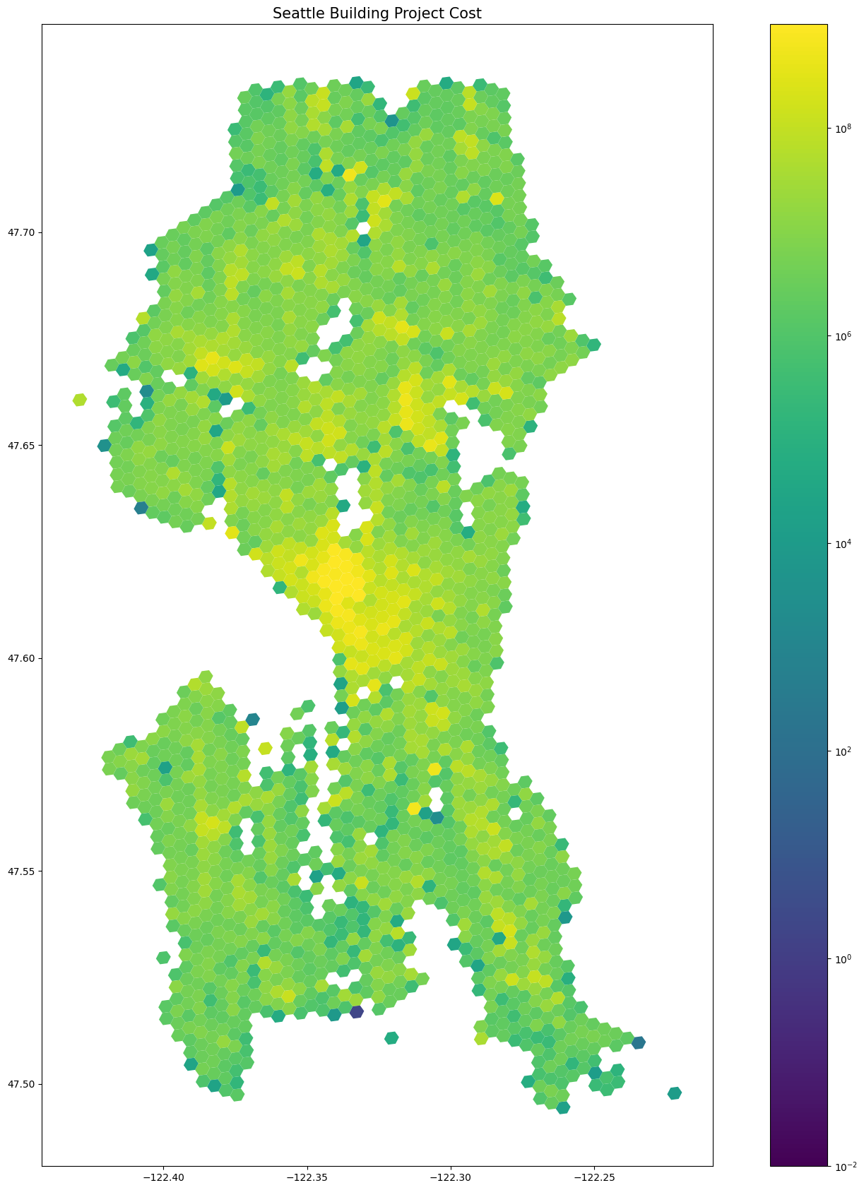
My first decision that I made with this data was how to leverage the location data. It was given in latitudes and longitudes, which on its own are not so useful when considering over 100,000 rows. A common solution to this that I have used in the past that I chose here was to aggregate geographically into hexagons. This means that every data point is split into an individual geospatial hexagon, and then the numbers are added together. For example, if ten different building permits are applied for in the same ‘hexagon’, their total amount of housing units can be added together to calculate the amount of housing unit applications represented in the entire Hexagon. The H3 python library is excellent for this.
Check out this static map I made of every building permit applied for in Seattle for 2007 to 2024, not counting a few thousand missing location and date data. The color scale represents the Estimated Project Cost of all permits in that hexagon. You can see that the higher numbers are centralized in Seattle’s population centers. Also note that the colors are on a logarithmic scale, making the visual differences less dramatic.
Now lets take a look at an interactive version of pretty much that same map. I made this one using the magical and easy geopandas.explore function which I strongly recommend to any fellow mappers. Note that it now lacks the logarithmic color scale, meaning you can easily tell how much more money goes into downtown than elsewhere in the city. Hover over an individual hexagon to see the Estimated project cost and amount of housing units added for all permits in the last seventeen years.
After making this map, I felt that it would be extremely interesting to try to include an element of change over time to the graph. So that is what I did! It took quite a bit of time because I had to teach myself some brand new techniques, but I am glad I did because I picked up a new skill 👍. Note a few imperfections in the chart below. Firstly, the date at the top lists January First when it really represents the whole year. The Scale in the top right of the map lists huge numbers, and there is no hover over tooltip! All travesties that will hopefully be improved upon next time.
So there it is. As you can see from this map, it is difficult to use the time slider feature to make any new big insights. I believe that I chose a slightly subpar time to implement a time slider because there isn’t some big yearly progress or change over time, so the graph ends up looking ‘noisy’ when all is said and done. That said, for fans of the page, expect to see some more time sliders in the future :).
Thanks for reading and the City of Seattle for the Data. If you’re interested in seeing some more, you can find the code I used to make these visualizations on my Github. Cheers!