Providence's tax income and land ownership
For my most recent project I did a study of Providence, Rhode Island! This was an interesting challenge for me because I typically work with data sets pertaining to places or things that I have personal prior knowledge of, but going into this I knew almost nothing about Providence. This meant that I didn’t know where the economic centers of the city were or who the biggest land owners would be, which was kind of nice because I wasn’t expecting anything in particular and I could really learn through the numbers.
For this project I was able to combine two different data sets about Providence, one of them was the ‘Property Tax Roll’, containing Property Tax information on every property in the entire city while the other was the Parcel boundaries which had geographic information. I was able to combine these data sets because they shared a Tax ID column and this let me make some interesting maps!
The city of Providence has right around 44,000 individual land parcels all paying tax (or not) separately. The entity that owned the most property was actually 361 different units in the same building at 1000 Providence Street owned by ‘Athena Providence Place’. There was a fascinating court case pertaining to the property tax of this building you can read about here!
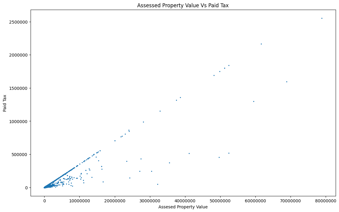
The image below shows every property, plotted by the amount of tax assessed on their property and the amount of tax actually paid.
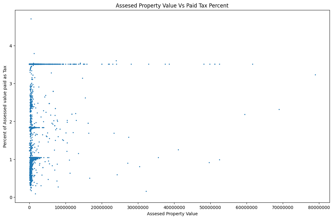
The next chart displays the same data, but distilled one more time. Now you can see the Assessed land value on the X axis and the percent of tax paid when compared to the assessed land value. We can see that Providence has three distinct tax brackets and on top of that has flexibility within the brackets.
Now lets take that data and map it! Below you can see that the residential areas seem to pay less when compared to their assessed value whereas properties in the business zones and along the water pay more. This must be due to Providence or Rhode Island tax rates for the land.
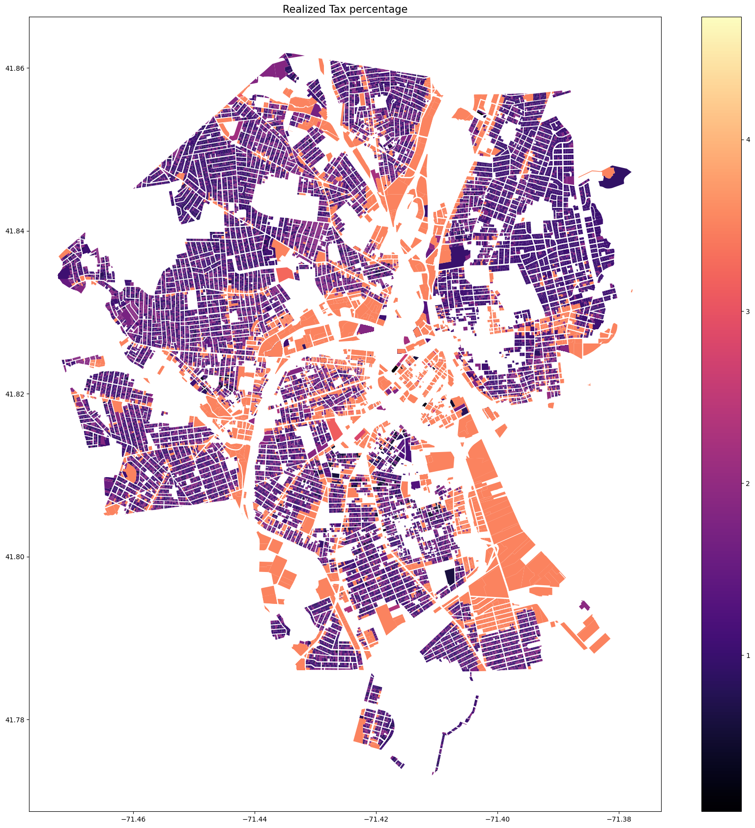
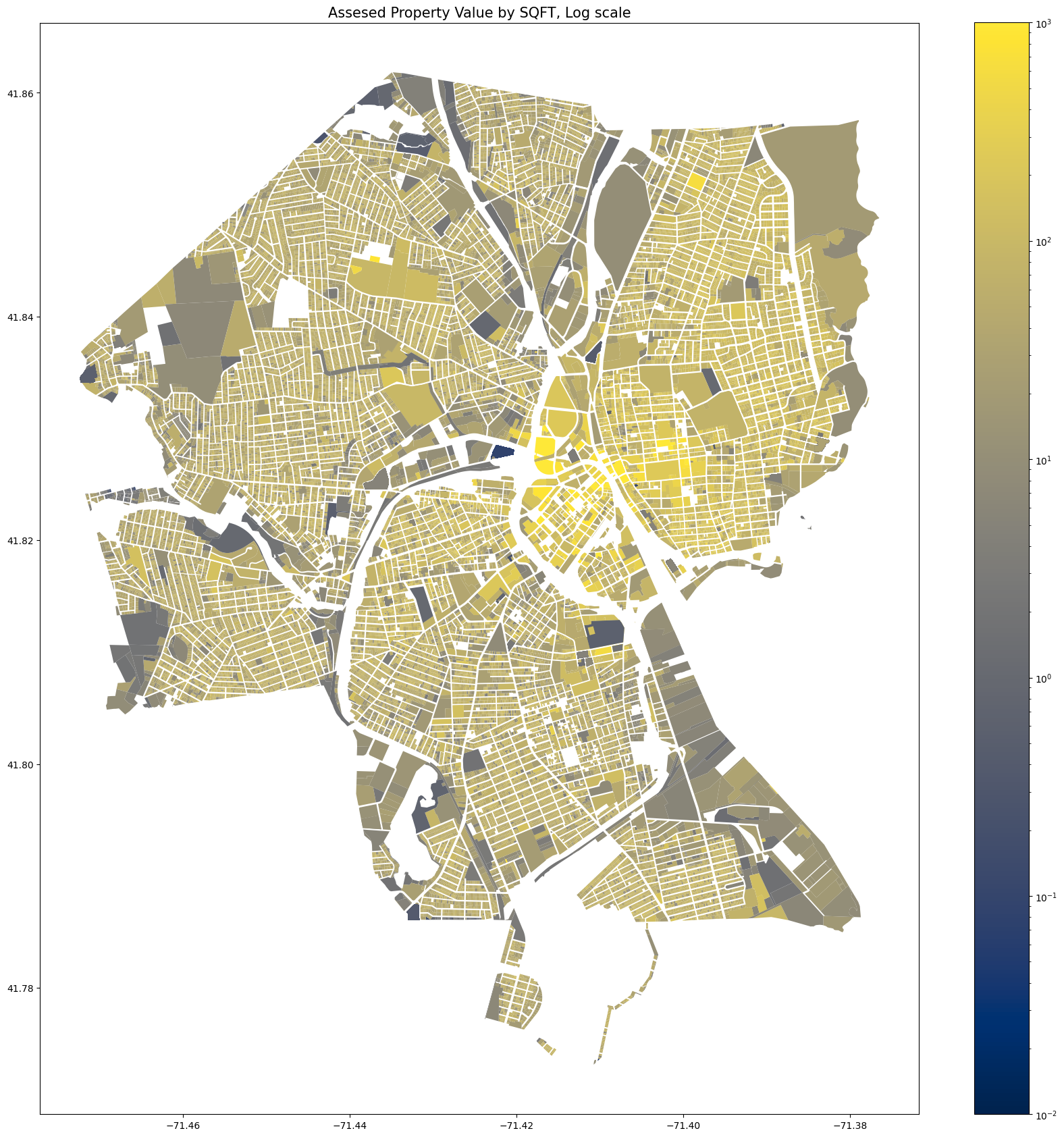
Now we can compare the map above, which looks at the tax paid as a percent of the assessed value with the map below, which looks at the tax paid per square foot. There are some clear similarities in the geographical patterns here.
Now lets take a look at the ownership by state! The large majority (over 90%) of the properties in the data set are owned by residents of Rhode Island. Take a look at the distribution below.
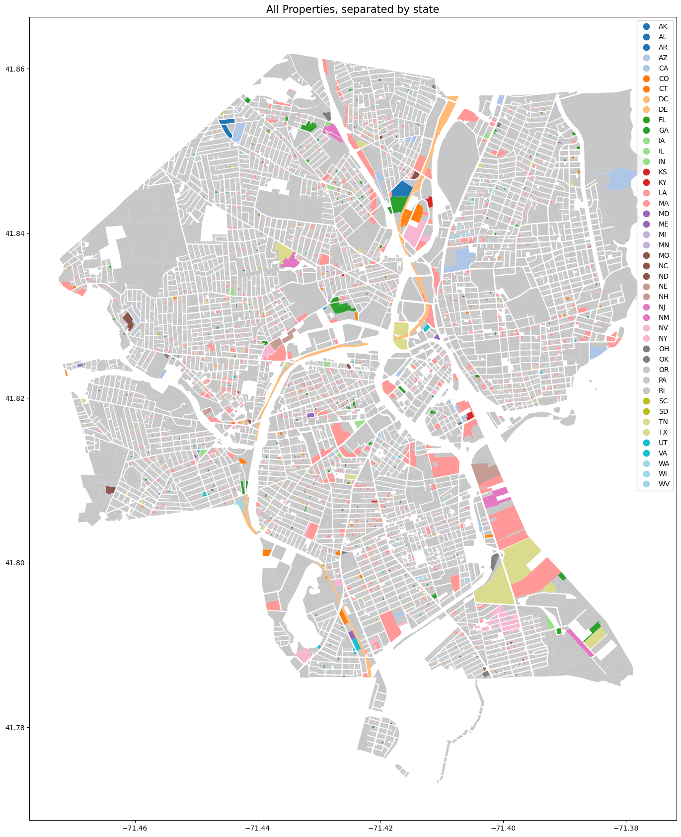
Enjoy similar data on an interactive map! I chose to exclude all properties owned by RI residents for legibility’s sake. The colors of the map below represent the owner’s state but you can hover over the parcels to get other information about the land.
Thanks for taking the time to read all this! Thanks to the City of Providence for providing the wonderful data, see the parcel data here and the tax data here. See the code that I wrote to make this project here.